British Columbia’s curve has been flattening. Things are working. And yet doubters remain.
In times like this, what we need are – cue drumroll – more math and graphs, clearly.
You know, by now about The Curve. It’s a graph (has any emergency ever been more graphed than this one?) that depicts the number of COVID-19 cases in a certain jurisdiction. Those graphs are plotted on a logarithmic, rather than linear scale, to reflect how viruses move through a population at an exponential rate. When the line on the graph starts to flatten, that suggests that we are slowing the spread of the virus through our collective action. Such graphs are a good indicator of COVID-19’s spread, but they are not without their flaws.
And when an indicator has flaws, some people are going to suggest that those issues hide the fact that we’re all doomed and that the authorities are either oblivious to our impending doom, or covering it up.
We’re not doomed, and our health officials aren’t flying blind. We’ll get to the evidence later, but first let’s talk about the reason for some skepticism and the genuine trouble with that curve.
There is one key weakness with the famous curve graph: that it’s based on cases we know about, not the ones that we don’t.
British Columbia is testing people at a very high rate. But it’s not testing everyone. That’s left some people asking, day after day, why we aren’t testing more. And nearly every day provincial health officer Dr. Bonnie Henry appears before the media and explains why. There are a couple reasons, but the main one comes down to logistics: there’s no way at the moment to both reliably test and process the tests of everyone who has a scratchy cough.
There are manpower concerns, but also issues with false positives and false negatives and a rash of other challenges. Most medical tests give false results. It’s been suggested coronavirus tests are even less reliable. That presents a danger if people go to get tested, get a negative result, and then act as if they’re in the clear. Similarly, false positive results suck up resources as confirmation tests are made. Those are small challenges individually, but if you test even 10,000 people every day, all those false results can have a destabilizing effect.
Anyways, back to The Curve and the cases it reflects. If we believe that curve, B.C. is on the right trajectory. But to believe that curve, you have to believe that it’s an accurate reflection of COVID-19 cases in the province.
Now, you don’t have to think testing is capturing every single COVID-19 case, or even most such cases. But you do need to figure out if testing is capturing a relatively consistent snapshot of cases. The famous curve graph works if the number of known cases roughly tracks the number of unknown and known coronavirus cases from one day to another. If, on Day 1 we know about 50 per cent of all cases, and on Day 10 we know about 50 per cent of all cases it works. If on Day 10, we only know about 30 – or 70 – per cent of the actual cases, then the line will lie.
And therein seems to be the rub. We can’t know what we don’t know, right?
Well, let me tell you about hospitals. These are the places where sick people…. OK. You know about hospitals.
Well, let me tell you about the graph of COVID-19 patients in hospitals.
I’ve been tracking this statistic for a couple weeks now, and it as likely the most reliable indicator of how things are progressing.
We might not know just how many cases exist, and we might not know whether testers are finding a greater, or lesser, proportion of the actual case load. But we know how many people have severe enough symptoms to require hospitalization.
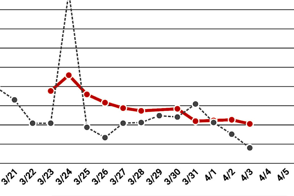
And what we know is that the rate at which more COVID-19 patients are needing treatment in hospitals has been steadily decreasing. In other words, even as the number has risen, it’s risen at a slower rate.
(One caveat here is that hospitalization rates vary by age so the figures will vary a little depending on the ages of people spreading the virus. But, also crucially, while COVID-19 doesn’t kill young people very often, it does hospitalize them at quite a high rate.)
So, with all that prologue, you can see just a little below this a couple graphs (they may take a moment to load). On Friday, Dr. Henry announced that the number of COVID-19 patients in hospitals had gone down.
That’s the first time it has happened, but even discounting that day and by taking a seven-day average, one can see that even as the number of people in hospital has risen, the rate at which new patients are entering hospital has steadily decreased. This is how a curve gets flattened. If the rate increases, that’s very bad. If it stays the same, that’s also not great. It means more and more people are filling our hospitals.
But if that rate decreases, if it heads towards zero, that means humans – me, you and everyone else who is washing their hands and holing up inside – are winning. It means the rate of spread of COVID-19 is decreasing.
That does not mean that the spread of coronavirus has stopped. But it means there is hope. It’s not a reason to start holding house parties. Instead, it’s a reason to increase our vigilance. It’s a reason to punch this horrible virus in the face, and kick it while it’s down – metaphorically of course. If you’re close enough to punch a virus, you’re doing social distancing wrong.
Do you have something to add to this story, or something else we should report on? Email:
tolsen@abbynews.com
Like us on and follow us on


